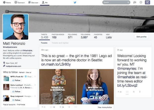
Twitter has been conducting tests with the aim to redesign the visual appearance of its profile pages.
Some of the major changes to expect include a huge profile picture placed on the left side of the new profile page together with a cover photo measuring 1500 pixels wide, which many observers say looks a lot of major rival Facebook. There will also be tweet counts and follower counts displayed on top of the photos. As for the tweet stream, the visual change will convert it into a mosaic type, giving users a more interactive interface.
The traditional timeline, which arranges tweets and posts chronologically in a vertical manner, will be eliminated. The new setup will provide users with a wider perspective on tweets, links and photos. Big and attractive content cards will be featured on the new profile pages. Many experts say that the comprehensive redesign may be highly influenced by Google+ and Facebook.
The change may have been brought about by its initial earnings report which were lower than expected. The new visual changes removes the vertical stream which gave Twitter its signature look. The social media giant is creating new approaches to attract and engage individuals, particularly those who have not tried Twitter before.
Due to the growing popularity of Instagram, Pinterest and Google+, which incorporate a lot of pictures and visuals, Twitter found the need to recreate its look by using more visual displays. Recently, Twitter incorporated in-stream photos to add color to its text-based streams. The new changes will keep it up to par with the competition and most likely bring in new loyal users.
What do you think of this move? Tell us in the comments!
Twitter Gets Set to Leave its Classic Vertical Look for a More Facebook-ey Front Page
Individual
$49.00/month$539.00 if pre-paid annually
Track 2 Hashtags
Compare 2 Hashtags
On Same Chart
2 Saved Views
1 Month Data Storage
Export Data
CSV,XML,JSON
Normal Support
Business
$99.00/month$1,089.00 if pre-paid annually
Track 8 Hashtags
Compare 4 Hashtags
On Same Chart
8 Saved Views
6 Month Data Storage
Export Data
CSV,XML,JSON
Premium Support
Enterprise
$189.00/month$2,079.00 if pre-paid annually
Track 20 Hashtags
Compare 6 Hashtags
On Same Chart
20 Saved Views
12 Month Data Storage
Export Data
CSV,XML,JSON
Premium Support
Agency
$349.00/month$3,839.00 if pre-paid annually
Track 40 Hashtags
Compare 10 Hashtags
On Same Chart
40 Saved Views
12 Month Data Storage
Export Data
CSV,XML,JSON
Premium Support


